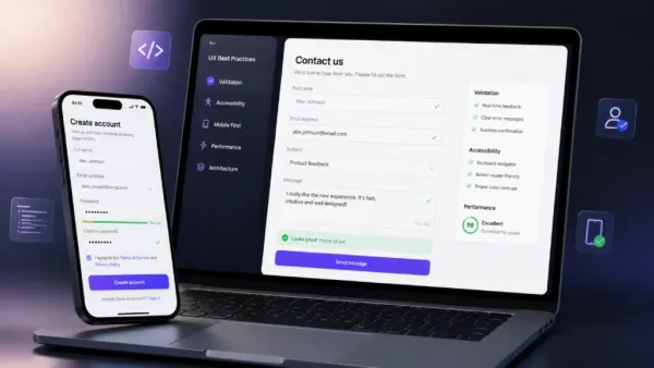
Weeks spent configuring state management, arguing about folder structures, fine-tuning build pipelines. Then someone slaps together a login form in five minutes that breaks the moment a user opens it on a mid-range Android phone. That’s the reality of modern frontend development without proper form UX, and it’s embarrassing.
Bad forms bleed money and conversion rates tank, support queues explode, and users bounce to competitors who bothered to care. This isn’t a design preference—it’s business survival.
A poorly built form tells every visitor their time means nothing, so they leave, and your metrics reflect that failure permanently.
Frontend Architecture: Building a Bulletproof Form Schema
Declarative beats imperative every single time.
- Hardcoding a dozen input fields with manual DOM manipulation creates a codebase disaster waiting to happen, because every new requirement means rewriting logic that should have been driven by configuration from day one.
Schema-driven builders like React Hook Form or Formik exist precisely to eliminate this mess, yet developers still reach for useState hooks scattered across forty components like it’s 2015.
- State synchronization is where most forms die a quiet death.
Controlled inputs give you a single source of truth but can cause visible typing lag on low-end devices if every keystroke triggers a full re-render of a massive component tree. Uncontrolled inputs feel faster but introduce stale state problems the moment validation logic needs to reference current values.
Honestly, the answer sits somewhere in the middle—isolate form state, memorize aggressively, and stop treating every field like it needs to update the entire application.
Accessibility cannot be an afterthought.
Building entire forms out of un-scrollable div tags because styling native inputs is “annoying” is professional malpractice, full stop.
Semantic HTML elements exist for a reason. Screen readers rely on proper form, label, and input tags to navigate your interface. Adding aria-* attributes take minutes, not hours, and the alternative is excluding millions of users because you couldn’t be more bothered.
The Anatomy of Labels in Form UX: Stop Playing Hide-and-Seek
| UX Element | Flawed Approach | Superior Approach / Reality | User Impact |
| Input Hints | Placeholders | Text vanishes instantly upon clicking | Forces brain recall, skyrockets cognitive load, climbs error rates, harms users with memory or attention challenges |
| Field Labels | Floating labels | Permanently visible top-aligned text | Tests slower in real usability studies, lacks speed of static labels due to animation and movement |
| Field Requirements | Asterisks | Explicitly stating “(optional)” | Tiny red stars confuse casual web browsers who miss them at smaller screen sizes, removing ambiguity respects mental bandwidth |
Validation and Error Messages: Be a Guide, Not a Cop
Premature validation is hostile.
- Firing an error the moment someone types their first character tells them they’re wrong before they’ve had a chance to be right, and that creates immediate anxiety that poisons the entire experience.

Proper architecture uses onBlur events or smart debouncing so validation only runs after the user pauses or moves to the next field, giving them space to actually complete their thought.
- Micro-copy matters more than developers admit. “Invalid Input” is a useless, robotic phrase that blames the user without telling them what went wrong or how to fix it. “Passwords need at least 1 special character” actually helps someone succeed, and that difference in tone transforms a frustrating moment into a guided one.
- Error placement must be predictable.
Messages belong directly below the offending input field, styled with high-contrast colors that pass accessibility contrast ratios, and wrapped with aria-live=”assertive” so screen readers announce the problem immediately. Visually impaired users shouldn’t have to hunt through the DOM to figure out why their submission failed.
Completion Flow: Sticking the Landing without Database Chaos
The submit button lifecycle is where backend chaos originates. Users double-tap when nothing happens after the first click, firing duplicate API requests that create duplicate records, send duplicate emails, and corrupt database integrity. The fix is simple: transform the button visually when the instant submission begins, show a spinner or skeleton state, and disable further clicks until the response returns.
Failure states need grace.
A 500 error from the backend shouldn’t wipe out thirty minutes of typed input or leave users staring at a blank form with no explanation. Nobody tests forms on actual budget phones running flaky 3D connections, meaning your sleek app totally shatters right when real people try using it. Falling back gracefully matters because losing typed data makes users instantly close tabs forever out of sheer rage.
A clear success screen outlining immediate next steps closes the loop and builds trust that your application actually functions.
Mobile Performance: The Overlooked Conversion Killer
- Testing exclusively on a MacBook Pro with fiber internet creates a dangerous illusion that your forms work fine, honestly.
Look, real users on mid-range Android devices face janky keyboards, viewport resizing chaos, and input lag that never appears in Chrome DevTools.
- Heavy validation libraries bundled without code-splitting can add hundreds of kilobytes to your initial load, forcing mobile users on 4G connections to wait several extra seconds before even seeing the form, whatever.
- Autofill behaves unpredictably across different mobile browsers, sometimes triggering change events that fire validation on fields the user never actually touched.
- Browser zoom on iOS breaks fixed-position error messages entirely, which is just great.
- Keyboard overlays hide submit buttons at critical moments unless you properly handle safe-area insets.
- Native date pickers render differently across Android skins, and custom dropdowns require touch target sizes of at least 44 pixels.

None of this surfaces in desktop testing.
- Deploying to production without real-device verification is how you ship a form that converts beautifully on your workstation and fails catastrophically in the hands of actual users.
Conclusion: The No-BS Bottom Line for Frontend Architects
Respect the user’s time. A great form behaves like a quiet waiter—it stays out of the way, does its job efficiently, and leaves no mess behind for someone else to clean up. Every extra keystroke, every confusing error, every wiped field is a tax on the person trying to give you their data.
Clean up your input components. Build accessible architectures that actually work on real devices, not just in Chrome DevTools on a MacBook Pro. Realize that your product’s ultimate success is measured by how easily people can hand over their information without wanting to throw their phone across the room. That’s the competitive advantage hiding in plain sight, and most teams are too lazy to grab it.
Contact to : xlf550402@gmail.com
Copyright © boyuanhulian 2020 - 2023. All Right Reserved.